Official livery concept for their car, the R26:
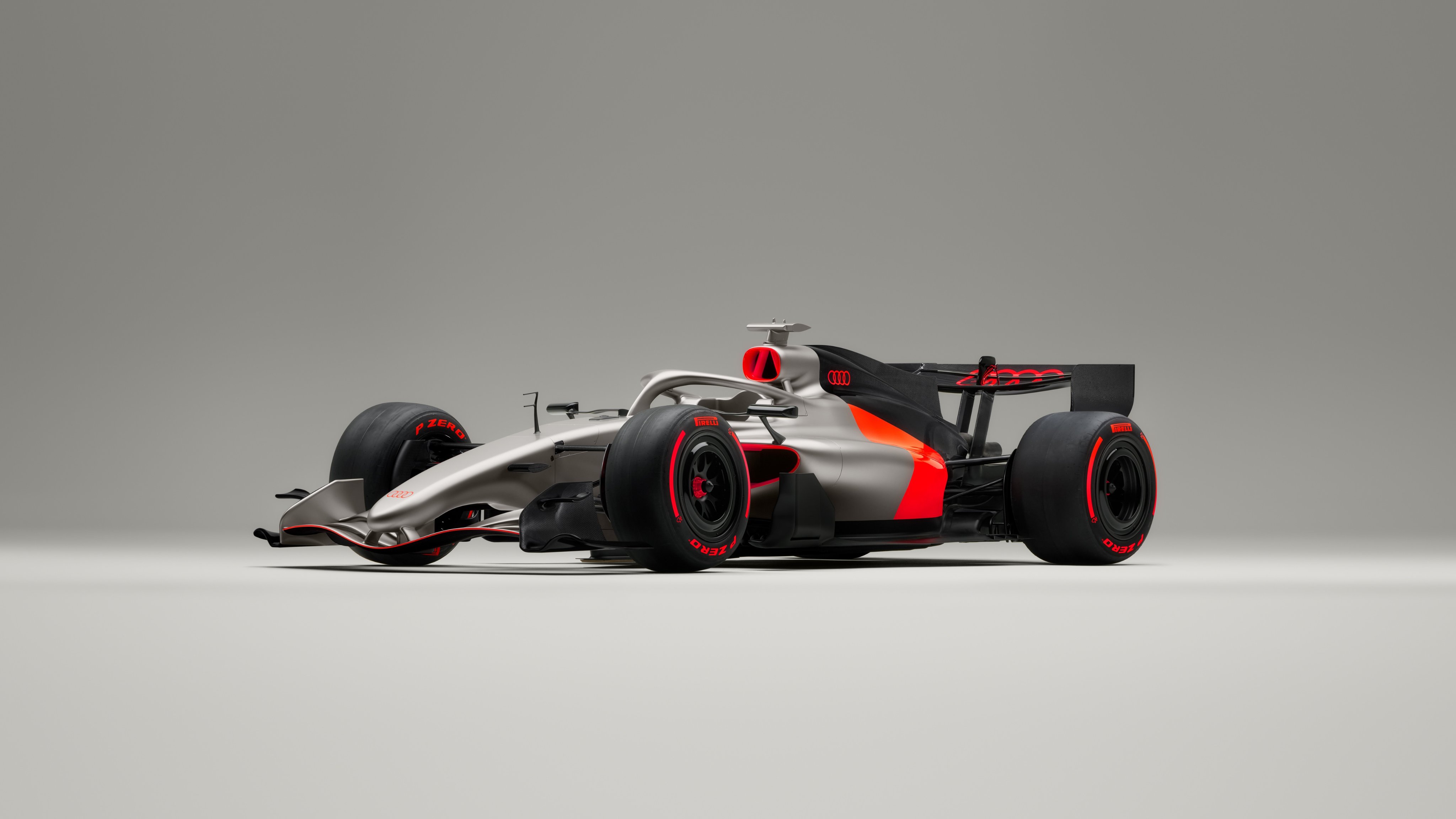


I agree, it's already one of the best Formula 1 liveries I've ever seen. Dynamic while being restrained, with a splash of red like an RS logo an a silver RS3/4/5/6/7. The color break right at the engine-monocoque interface is clever and makes me wonder why we haven't seen that more often. Overall, a good continuation of the Audi endurance racing color schemes, which were always good.

Given that there is 2 weeks and 3 days until the private test in Barcelona starts, to have a car ready for shakedown so early could suggest they are playing it safe with the first car to make sure it is reliable rather than fast.De Wet wrote: ↑08 Jan 2026, 15:34https://www.planetf1.com/news/audi-f1-2 ... ign_260102
Filming day tomorrow it seems...