- Login or Register
No account yet? Sign up

George Russell claimed his first Formula One sprint race win at the 2026 Chinese Grand Prix, maintaining his perfect start to the season after a closely fought contest that highlighted both Mercedes’ strengths and the evolving competitive order under the 2026 regulations.


That’s happening for sure. No way to know if it will be competitive or not. Technically they will be behind if it’s a brand new concept.

PlatinumZealot wrote: ↑17 Sep 2026, 05:01FTM is not a big loss to the engine or else they would not do it.

That's just Ferrari. The only exception is the Todt era. I don't expect anything else from them.Darth-Piekus wrote: ↑16 Sep 2026, 15:57Instead of bothering if Lewis is rent free in your head you should be bothered that Ferrari has two good drivers but a circus of a team.

They seem to be moving backwards. Gained a lot with McLaren's and Red Bull's issues. It already feels like they're going to hover around the 3-4th power for the rest of the regulation, as usual for Ferrari. McLaren seems clearly in front now.deadhead wrote: ↑16 Sep 2026, 21:05September 2022, President John Elkann:
"I am confident that by 2026 Ferrari will return to winning a Constructors' World Championship and a Drivers' World Championship. We will achieve it before the 20-year drought, given that our last Drivers' World Championship dates back to 2007 and the Constructors' to 2008."
Tall order. Maybe 2027!
Any more details about the source of this? Are they being selective about the straights, or are they aggregating between all full throttle zones in a track? If yes, what kind of aggregation?AR3-GP wrote: ↑17 Sep 2026, 17:23Red Bull and Ferrari spend similar amounts of time on the straights. Much closer to each other than either of them to Mercedes. This is before taking into account the power loss from Ferrari's FTM. Most of the data included in this average does not include Ferrari's ADUO 2 PU. So they are likely matching the ADUO-less RBPT now for total PU performance. That's the first myth gone about what people think the gap between Ferrari and RBPT is.
https://i.postimg.cc/V6Z0TkV0/image.png
Two points:Emag wrote: ↑17 Sep 2026, 17:59Any more details about the source of this? Are they being selective about the straights, or are they aggregating between all full throttle zones in a track? If yes, what kind of aggregation?AR3-GP wrote: ↑17 Sep 2026, 17:23Red Bull and Ferrari spend similar amounts of time on the straights. Much closer to each other than either of them to Mercedes. This is before taking into account the power loss from Ferrari's FTM. Most of the data included in this average does not include Ferrari's ADUO 2 PU. So they are likely matching the ADUO-less RBPT now for total PU performance. That's the first myth gone about what people think the gap between Ferrari and RBPT is.
https://i.postimg.cc/V6Z0TkV0/image.png
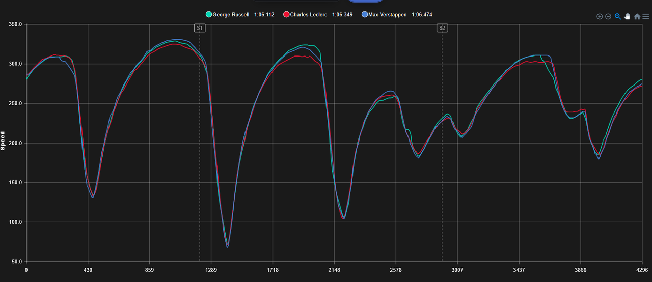
If you look at a pre-aduo Ferrari engine, let's say, Austria qualifying which would demonstrate their weakness the most considering their compromises, the Ferrari PU was an absolute joke :
https://i.postimg.cc/5N7RyvkL/image.png
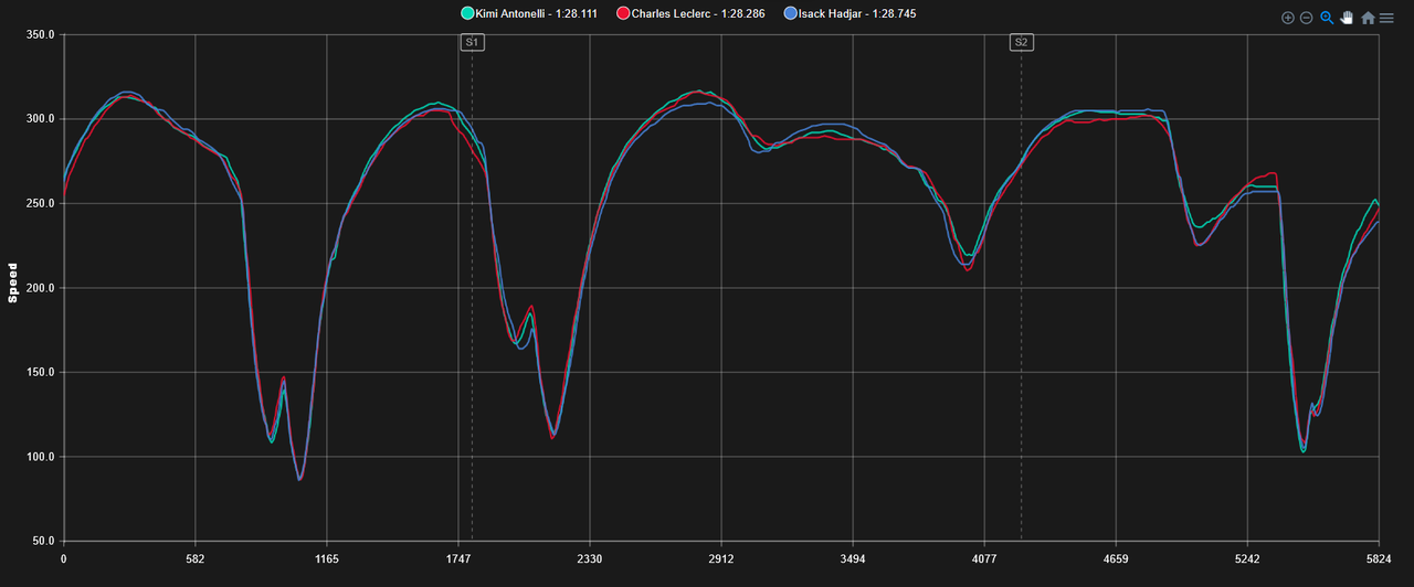
Even a race later at Silverstone, it doesn't really look any better :
https://i.postimg.cc/50swg5zG/image.png
Some try to say on this forum that Ferrari is slower on the straights because they went for more downforce.Emag wrote: ↑17 Sep 2026, 17:59Any more details about the source of this? Are they being selective about the straights, or are they aggregating between all full throttle zones in a track? If yes, what kind of aggregation?AR3-GP wrote: ↑17 Sep 2026, 17:23Red Bull and Ferrari spend similar amounts of time on the straights. Much closer to each other than either of them to Mercedes. This is before taking into account the power loss from Ferrari's FTM. Most of the data included in this average does not include Ferrari's ADUO 2 PU. So they are likely matching the ADUO-less RBPT now for total PU performance. That's the first myth gone about what people think the gap between Ferrari and RBPT is.
https://i.postimg.cc/V6Z0TkV0/image.png
If you look at a pre-aduo Ferrari engine, let's say, Austria qualifying which would demonstrate their weakness the most considering their compromises, the Ferrari PU was an absolute joke :
https://i.postimg.cc/5N7RyvkL/image.png
Even a race later at Silverstone, it doesn't really look any better :
https://i.postimg.cc/50swg5zG/image.png
It's not fun when people don't report facts, like you've done here:
One of these has nothing to do with the other. Just because they have extra downforce, doesn't mean that they've done enough with it to bridge the PU gap to Mercedes. I didn't say that was the case. They have just extracted more from it than others and the straight-line loss was made up for compared to an SF26 without FTM, otherwise it wouldn't be on the car. That's why Mercedes removed their own in Madrid and that's why Red Bull removed there's in Monza.sucof wrote: ↑17 Sep 2026, 18:42Some try to say on this forum that Ferrari is slower on the straights because they went for more downforce.
Now this is complete BS, as you can see in every telemetry, they do not have nowhere near as much speed benefit in the corners or under breaking as they loose on the straights. So this is just debunked.
Just as their new engine debunks this too, since you can clearly see their difference in straights are a lot less, sometimes halved, while the cornering speeds are still unchanged, similar to other top speeds.
1. I picked Austria because its a type of track that would really punish a weak PU. But in Silverstone as well, Ferrari were struggling in the straights. They just came up with a very good deployment strategy that negated some of that. Mercedes copied it, RedBull did not, so it's hard to directly compare.AR3-GP wrote: ↑17 Sep 2026, 18:36Two points:
1) Austria is a high-altitude outlier. The data is averaged from Rd4 to Rd13. With such a massive data set (Rd4 to Rd13), the average is much more representative than the outlier. Ferrari experienced a circuit specific PU degradation in Austria related to smaller turbo and high altitude.
2) You're showing plots that illustrate top speed, not "time on straight". Top speed can be completely uncorrelated with power in this ruleset (that's why Haas and Cadillac are always randomly at the top of the speed traps despite 3rd best PU). Any team can delay the deployment to the end of the straight to get a higher top speed at the expense of worse acceleration. Weak cars like Haas and Cadillac don't have the grip to use full 1000hp from low speed, so they are more likely to defer some of the electrical deployment to higher speed range where it can be used (but at a lower efficiency) instead of just generating wheel spin at low speed which is 100% energy loss. Time on straight is a far more accurate metric when comparing PUs and there is a reason why the Mercedes powered teams are clustering at the top, followed by RBPT, followed closely by pre-ADUO Ferrari. Because that's the actual PU pecking order.
The nice thing about a time on straight analysis is that it completely removes the straight specific deployment differences because time on straight is a cumulative property. By the end of the lap, everyone has used all of the energy allowed across all of straights. Deployment differences are effectively normalized.