Pagani Huayra unveiled

Breaking news, useful data or technical highlights or vehicles that are not meant to race. You can post commercial vehicle news or developments here.
Please post topics on racing variants in "other racing categories".
User avatar
JohnsonsEvilTwin
0
Joined: 29 Jan 2010, 11:51
Location: SU 419113

Re: Pagani Huayra unveiled

Post

Horses for courses Andrew.

Personally I think the F40 was a vile plastic looking kit car wannabe.
Pagani WILL make you look 2 3 or 4 times. If only because you detest it, loathe it, or love it. The design invokes opinion, saying otherwise is false IMO.
More could have been done.
David Purley

manchild
manchild
12
Joined: 03 Jun 2005, 10:54

Re: Pagani Huayra unveiled

Post

JohnsonsEvilTwin wrote:Horses for courses Andrew.

Personally I think the F40 was a vile plastic looking kit car wannabe.
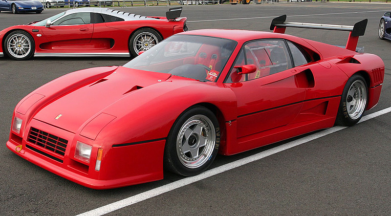
Oh c'mon, it is in the top 3 of most beautiful Ferrari's ever. One of the first if the first car that used CF, and was pure sports car with no stereo, leather and other passenger crap.

Image

F40 was amazingly clean design wise, nothing to add, nothing to remove, genuine and unique. It was the peak of design approach started with 308. 328 was beautiful too, 288 was amazing with sort of Group B aggressiveness (my favorite).

Image

The only black sheep in that series was 348, which was undefined, it wasn't neither edgy with flat surfaces or curvy. 355 finally established curvy shape.

The only ugly plastic wannabee Ferrari's from the 80s was 288 "evoluzione" Image
User avatar
JohnsonsEvilTwin
0
Joined: 29 Jan 2010, 11:51
Location: SU 419113

Re: Pagani Huayra unveiled

Post

Im afraid manchild, to these eyes at least, The F40 looked cheap and nasty. It was a great car because it was the first supercar to take weight loss seriously.

I can see some saying the Huayra isnt there cup of tea, I appreciate that as its not meant to appeal to everyone.
Equally the F40 was a car pininfarina themselves described as function primary to from, hardly the last word in design. It did its job spectacularly well did the F40. But for reasons of this thread I think Pagani intentionally kept the design along the lines of the Zonda to give it some instant pedigree.

The good thing here is beauty is in the eye of the beholder. No one is wrong :D
More could have been done.
David Purley

Giblet
Giblet
5
Joined: 19 Mar 2007, 01:47
Location: Canada

Re: Pagani Huayra unveiled

Post

The F40 looked awesome in it's day, and still looks awesome now. Looks are slightly dated, but not in a bad way. A good clean design is a good clean design and stands the test of time. Look at the drivers eyeline, straight down the hood to the road in front.

Of course it's all subjective and opinions will differ (thank goodness), but there are many writers, reviewers, and testers that still consider it the first true supercars, and the ultimate definition of the category.
Before I do anything I ask myself “Would an idiot do that?” And if the answer is yes, I do not do that thing. - Dwight Schrute

Formula None
Formula None
1
Joined: 17 Nov 2010, 05:23

Re: Pagani Huayra unveiled

Post

The Zonda was always bordering on cheesy. Unfortunately they've jumped the catfish, as it were, and gone full fondue.

The rockers look a little cheap :/

Image

That is one nice exposed flappy stick linkage though:

Image

And it has moving front radiator exits and rear winglets, so points there in my book:

Image

Image

manchild
manchild
12
Joined: 03 Jun 2005, 10:54

Re: Pagani Huayra unveiled

Post

Formula None wrote:Image
Interior is horrible, silver and light brown. Like it has gone trough "Pimp my ride".

This would fit like a glove:

Image

:lol:

User avatar
Pandamasque
17
Joined: 09 Nov 2009, 17:28
Location: Kyiv, Ukraine

Re: Pagani Huayra unveiled

Post

I have to agree. The leather looks nice but that center jukebox thing looks like a huge version of a Chinese cell-phone toy for 3-year-olds implanted into the interior. The toy-ish blue instruments make the dash look just as bad. The Zonda interior wasn't as good as Spyker's (sharing the similar style), but it had some taste a least.

PS: what's that thing in the middle of the driver's seat? A cup-holder? A rocket shaft?

andrew
andrew
0
Joined: 16 Feb 2010, 15:08
Location: Aberdeen, Scotland - WhiteBlue Country (not the region)

Re: Pagani Huayra unveiled

Post

The simplicity in the design of the F40 was what made it such a good looking car.

This Pagani thing is yet another car where the designers kept saying "Lets put a line here and here and here and here and here and here....." Sadly no one told them to stop until 3 month of line drawing. #-o

wesley123
wesley123
204
Joined: 23 Feb 2008, 17:55

Re: Pagani Huayra unveiled

Post

Well I have made a decision, it is ugly. I prefer the Zonda way above this one. This one looks like a supercar truck, it looks so incredibly fat, heavy and hard to control, it seriously looks like a SUV.

But on that pic, are the rear winglets moving different? it looks like the left has a higher position than the right.
"Bite my shiny metal ass" - Bender

User avatar
JohnsonsEvilTwin
0
Joined: 29 Jan 2010, 11:51
Location: SU 419113

Re: Pagani Huayra unveiled

Post

It weighs 1350 kgs...that over 150 kgs less than the 458 ferrari.

And it has 1.5g cornering ability...bonkers!

And it has the same torque to weight ratio as a a bugatti veyron SS.

Question the styling, as that is personal preference. I love it, most dont by the looks of this thread.
But it will outdo 99.9 % of supercars with some cash to spare :wink:
More could have been done.
David Purley

nobeard
nobeard
0
Joined: 31 Jan 2011, 14:55

Re: Pagani Huayra unveiled

Post

Still think it lacks a little crazyness. The first zonda was crazy in its design, and that made it special. This looks nice, as a 458, but not crazy like the Zonda.

If I was to spend 1M$ + on a car I would at least want it to look completely MAD... like an orange Lambo SV.

User avatar
JohnsonsEvilTwin
0
Joined: 29 Jan 2010, 11:51
Location: SU 419113

Re: Pagani Huayra unveiled

Post

Some say it looks fantastic, others say its ordinary, others that its ugly.

I would say Pagani succeeded in replacing the Zonda then, as that split opinions equally. :wink:
More could have been done.
David Purley

Caito
Caito
13
Joined: 16 Jun 2009, 05:30
Location: Switzerland

Re: Pagani Huayra unveiled

Post

Pandamasque wrote:PS: what's that thing in the middle of the driver's seat? A cup-holder? A rocket shaft?

If i had to guess I'd say seatbelt, 5 point, that's the balls one :p.

Too much for my opinion. Exterior-wise it might be ok, but the interior... guack.
Come back 747, we miss you!!

hecti
hecti
13
Joined: 30 Mar 2009, 08:34
Location: Montreal, QC

Re: Pagani Huayra unveiled

Post

JohnsonsEvilTwin wrote:Some say it looks fantastic, others say its ordinary, others that its ugly.

I would say Pagani succeeded in replacing the Zonda then, as that split opinions equally. :wink:
Well said! I agree completely, pagani's are supposed to have this kind of reaction

lolzi
lolzi
0
Joined: 22 Aug 2010, 14:08

Re: Pagani Huayra unveiled

Post

I think it looks like a Zonda mated with a fish.
It's way too close to the Zonda to be a "crazy" like the Zonda was, and it's way too fiddly and strange to be beautiful.